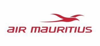
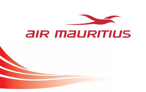
It was high time our national airline got a new logo, because the old logo was really getting outdated. The font was too common (Arial?) & it took a scientist to figure out that the logo represented a bird, namely the Paille en Queue.
The new logo has an easily distinguishable bird with a slightly deeper shade of red – not exactly web 2.0, but highly convenient for an airline. The font’s better as well (any idea what font’s that?) with a contemporary combination of cases. In short, the new logo pwns the old one. But actually, I’m in fact looking forward to the completion of the branding of Mauritius. Whoever gets to design it will need to think up of something that will be the very quintessence of Mauritius. If you watch BBC World News, you would have noticed how striking this can be – Incredible India, Malaysia Truly Asia, etc. Information on the new visual identity of Air Mauritius:
The tropicbird:
- The tropicbird sign has been reworked. It now looks more figurative, with curves that enhance its energy and appeal.
- The bird is shown in flight, which implies movement and invites one to embark upon a journey.
- More compact, it now has only one space separating different parts of the logo (the body of the bird and one wing).
The colour:
A more saturated red is used. When used on any print vehicle, the effect is higher status and higher impact.
The typographic design:
- It suggests both the high status and proximity.
- It uses both upper- and lower-case letters and Italics to suggest that the company is dynamic.
Visual identity codes:
- In order to strengthen its own identity on all corporate communication vehicles, a visual motif inspired by the four stripes of the Mauritian flag will be used. It looks like a flag waving in the breeze or ocean waves inviting you to embark on a journey of discovery.
- Iconography will mostly use photos of the island and the islanders.
The press release:
Air Mauritius Gives a New Boost to its Image With the Unveiling of a New Visual IdentityAir Mauritius has today revealed its new visual identity including a modernised and vibrant logotype which symbolises the airline's new ambitions. An energised "Paille en Queue", the mythic tropic bird, soars through the air, providing a new drive to the national airline. This latest move completes the process already initiated with the new cabin design and new uniforms.
On the 1st of July, the airline completed the reconfiguration of all its medium and long haul aircraft and introduced a new two class cabin layout. A new warmer cabin design gives passengers a feel of Mauritius as soon as they step on board. New uniforms were launched in October. A revamped Kestrel Frequent Flyer program was earlier introduced in April. The airline has concurrently reinforced its international partnerships providing more destinations and more frequencies to its passengers, and uplifting Mauritius' status as the Indian Ocean hub.
This drive for improving our offer takes a new meaning today with the unveiling of our new visual identity. As the national airline of the Republic of Mauritius, Air Mauritius is the lifeline and flagship of the country. The new version of its logo was a natural evolution in line with the airline's quest for modernity, refinement and friendliness.
"The Paille en queue has been associated with Air Mauritius since its creation. It symbolises the national airline in the hearts and minds of all Mauritians. This is why we decided to retain this icon and instill a new dynamism with the new look. The new logo and new visual identity recall the four stripes of our national flag as a clear demonstration of the strong bond which exists between the company and the country. This new visual identity will be progressively introduced on our aircraft and all our communication tools." says Manoj R.K. Ujoodha, G.O.S.K., CEO of Air Mauritius during a presentation of the new corporate identity to the press this afternoon in the presence of the Chairman of the Board, Mr Sanjay Bhuckory.
During the recent years, Air Mauritius has faced a more challenging environment ranging from the opening of air access which has introduced more competition, the pressure on costs arising from high oil prices and volatile foreign exchange patterns. As the national airline, Air Mauritius turned these challenges into opportunities for growth and engaged a change process designed to reinforce the airline's leadership role in the region and to support the tourism industry's growth objectives of two million tourists in the medium term. The airline also remains committed to play its role as lifeline and will continually adapt its offer in line with customer expectations.
About Air Mauritius:
Air Mauritius is the national carrier of Mauritius. Founded in 1967, it serves more than 24 destinations on 4 continents with a fleet of 5 Airbus A340-300, 2 Airbus A340-300E, 1 Airbus A330-200, 2 A319 and 2 ATR 72-500. During its last financial year, Air Mauritius carried 1,3 million passengers, representing more than 55% of the passengers using Sir Seewoosagur Ramgoolam international airport in Mauritius. The island's leading carrier and the fifth largest in the Indian Ocean, Air Mauritius has 2800 employees and makes a major contribution to the key drivers of the island's economy, in particular the tourist industry.


Please don't spam & don't swear!
Subscribe to my feed
All Mauritians have always known the original logo. It has never been changed. I'm a little skeptic concerning the font but the changing the the lower and uppercase game is great. Now the "Paille en Queue" looks like a real one. In any case, the new logo is better than the old one.
@sachin
I saw the wave designs they've decided for the airplane... & I was thinking why don't they just paint the whole plane with some scenery? :P
You have a point there. That would have been a great idea! I see a plane landing with a beach scenery! Man, you should send them a mail or something!
I like the logo. Simple, yet Pro work! :D
and its not too different if u look at it from far.(u dont really look at a plane from close so often. lol..)
but great logo! We love it! We love Curves!
The new logo is much better. I wished i had one of the airbus for me wlol :P
Nice revamping of the logo :)
I liked it too, at the first sight lol!
Bof..it seems the same old one with a 'liftting' job...thought they'd change the whole concept...
what's changing a logo? u don't copy the old one by changing the font and smoothing the bird... :P
I totally agree the concept of changing a logo is to actually make something fresh and "New" I don't like the logo for me its similar to the old one and I know Graphic Design companies in Mauritius which can create much better design. By the way who design the logo?
Post a Comment
Some html tags like <b>, <i>, <a> are allowed & emos can be used. ;)
Copy your comment before posting in case something fails.
Comments are moderated, may take a while to appear.