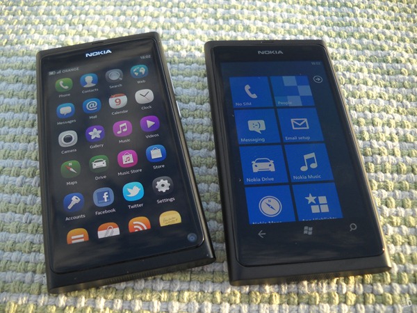
Thanks to Nokia Connects, I finally have my hands on Nokia’s first Windows Phone device - the Lumia 800.
So here’s the box. It does look remarkably similar to the one in which my N9 came in, because it is. The Lumia 800 & N9 have practically the same shells.
Windows Phone 7.5 Metro UI features prominently on the box, alongside references to apps like Angry Birds, Facebook & Twitter…
& the specs. Internet Explorer being promoted as a key feature. Hmm….
Unboxing. Beneath the first layer of phone, you have a layer of manuals & a layer of soft cover.
The accessories. Unlike the N9, there was no hidden message.
So here are all the contents. A Quick Guide & manuals in 3 languages. The Lumia 800, USB charger AC-16, data cable CA-185CD, stereo headset WH-902 and the soft cover.
Compared to the N9, the Lumia 800 looks like a twin sibling. In fact, they both have exactly the same dimensions. But there are a few key differences.
The Lumia 800 has 3 capacitive buttons, which means the screen is smaller – 3.7” as opposed to the 3.9” on the N9. It also has a camera button as mandated by WP7 chassis requirements. & it doesn’t have a front camera.
The LED flash is also located on top of the camera module. Everything else though is exactly the same including the USB slot “door.”
Let’s power on the Lumia 800, shall we? This is a screenshot of the lock screen.
The Start screen…
Wait, you can’t see anything? Well, that’s because Windows Phone 7.5 doesn’t have any screenshot app, neither built-in nor easily installed. There is a screenshot app called Screen Capture v3, which is a homebrew app. To install it, you need to dev-unlock the phone, which costs $99 (from Microsoft). Clearly, I’m not going to do that, so to all purposes, WP7 is the only mobile OS that doesn’t support screenshots.
Whoever was responsible for this – there is no other way to say this but bluntly – is a massive idiot. Screenshots are an integral part of any OS because it’s the easiest way to promote that OS. Look at all the phone reviews, app reviews, support threads, UI fix suggestions. How can I do a review without screenshots!?
Unfortunately, I’ll have to do it the prehistoric way – taking photos of the phone.
So that is the lock screen. Displays the date and all your notifications. Like the N9, WP7 does away with the slide-to-unlock gesture that has unnecessarily complicated our lives (on iOS & Android devices). You just need to swipe upwards. Easy peasy.
The Metro Start screen. The Lumia 800 uses a very specific colour for the Tiles theme – Nokia Blue.
It’s a significant departure from the app grid that’s common in other OSes like MeeGo on the N9.
So that was the unboxing. For the first time, I’ll be doing dual review, comparing the N9 with the Lumia 800. Old Nokia vs new Nokia. I’ve been using the Lumia 800 for a week now and I’ve experienced both delight and nearly tearing my hair out… :)
& Lumia users, if you’re experiencing horrible battery life (you should!), here’s how to manually install the latest update.


Please don't spam & don't swear!
Subscribe to my feed
Post a Comment
Some html tags like <b>, <i>, <a> are allowed & emos can be used. ;)
Copy your comment before posting in case something fails.
Comments are moderated, may take a while to appear.