After reviewing the hardware, it’s time for an in-depth look at the OS - Symbian^3. The inevitable comparison would be with the N97, released exactly a year ago & running Symbian^1 – which I’ve already reviewed. Let’s see what has changed…
This post is Part 2 of Nokia N8 Review series. The remaining posts are here:
- Part 1 - The Hardware
- Part 2 - The OS
- Part 3 - Native Apps
- Part 4 - 3rd Party Apps
- Part 5 - Gaming
- Part 6 - The Camera
- Part 7 - Final Thoughts
S60v5 or Symbian^1 was the first iteration of Nokia's foray into the touchscreen market. Symbian^3 was expected to clean up the legacy code (laying the foundations of Qt) & Symbian^4 was supposed to have the much-awaited new UI.
In the meantime, Nokia have had a new CEO & this ^x nomenclature has been dropped in favour of a continuous development cycle. In other words, Symbian OS will be continuously updated & all devices will have the same upgrades (as long as their hardware can support it). This is definitely a better deal for both Nokia & users.
The Nokia N8 runs what's used to be called Symbian^3. Compared to S^1 or S60v5, S^3 has optimised the UI for single tap interaction. There's no select & tap. Given that some apps were built for S^1, I understand the old UI is still being used. However, it baffles me that some built-in apps like the Camera are still using the old UI!
Being capacitive, touchscreen performance is very responsive. Sometimes, you'll inadvertently press buttons (more of a UI positioning fail) & left wondering - "Hey, when did I touch that?"
At other times, it requires what I'd describe as a "firm" press - lightly tap the screen, the tap is acknowledged by the actuation of haptic feedback (small vibration), but the OS doesn't register it.
Multi-touch is available, with only pinch-to-zoom in the browser, photo gallery, maps & camera. It's hardly used anywhere else.
While I wouldn't say that S^3 is slow, several times I've had to wait for the OS to catch up while I did several actions at the same time. Maybe it is the relatively slow CPU, but it's nowhere near fluid as WP7.
Is it stable? Yes, it is. Incredibly stable. The large amount of memory (256MB) seems to have done loads more good than I previously thought. Over the 1 month I've been using the N8, I had to reboot it only once to rescue it from a hanged app. Otherwise, the task manager is enough to close a non-responsive app.
When using the accelerometer to change orientation, the OS adds a 1-1.5s lag with no rotation animation to mask the lag. Far too often, I've been left wondering, "Wait, why hasn't it rotated?" I hope this will be fixed in the next firmware or with a hack. An orientation lock switch would have been most welcomed...
The Home screen
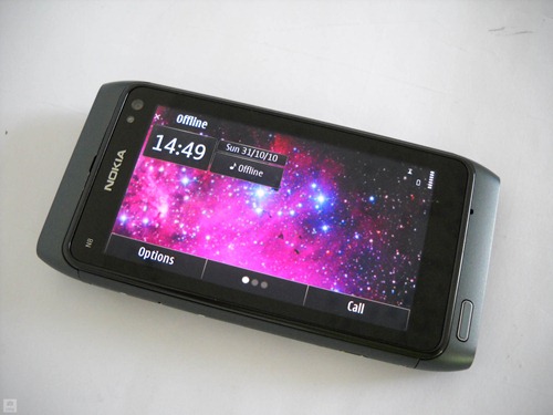
The major innovation is that Symbian^3 allows you to add up to 3 home screens on the N8.
You can access each home screen by swiping left or right. One peculiar behaviour is that the screens do not move along with your gesture but only after you end it. Otherwise, a much simpler way to cycle though each home screen is to tap the centre button, where each dot represents a particular screen.
Animated wallpapers can be used, only if it's included in a theme. There's no support for panoramic wallpapers. Changing wallpapers from the home screens is pretty straight-forward. Swipe to the desired screen, tap options, edit Home screen, change wallpaper, select, done.
On the other hand, if you're using the Photos app & select a wallpaper, the image is applied by default to the 1st home screen. To set a wallpaper to a desired screen, you must switch (with task manager) to the home screen, swipe to the desired screen, switch back to the Photos app & apply the wallpaper. Here's another example of UI inconsistency - the Photos app allows you to crop images used as wallpaper. On the other hand, setting a wallpaper directly from a home screen resizes the image to fit the screen.
As with the N97, you can add widgets to each home screen, with an offline mode to prevent them from exceeding your data usage. Widgets can be moved around, but not between home screens.
Most of these widgets suffer from a lack of screen estate. As they can only occupy a small rectangle, the email, messaging, RSS & even Gravity's twitter widget can only display 3 lines of text.
Here's a video preview of the new home screens. Used a tripod this time. ;)
Notification Area
Found at the top right of the home screen & bottom middle in landscape, the notification area is another leap forward from S^1.
Tap the area near the battery meter, & you're presented with these 3 options. First one opens the Connectivity settings, from where you can change network, turn on Bluetooth & Wifi, etc. Middle option is the clock.
The last one gives the % of battery left. It's not an exact measure as it only shows increments of 10. & here I discovered that the full 7 bars actually represent between 70% to 100% of battery.
It also gives you the option to turn on Power saving mode, which is another massively useful feature. Power saving mode reduces the screen brightness to the minimum, switches to GSM, turns off Wifi, Bluetooth, vibration, etc. In short, an ultra low-power mode. Ideal for making the N8 last the day during long trips. :)
Just below we have the drop-down notifications menu which links to events such as unread messages, missed calls, wifi connections, bluetooth & FM transmitter (if ON), USB removable devices & so on. My only gripe is that it doesn't scroll. Items with less priority disappear to make place for others. I hope Nokia takes note of this & extends the functionality of this notification area to include use by 3rd party apps...
Call
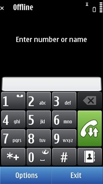
Don’t forget, the N8 is also a phone. Tapping the call button shows this screen. You can dial in a number or search for contacts. However you don’t actually need to type in each letter; just press the corresponding number key & the contact shows up. The green button shows the logs & each number can be assigned for speed dialling. :)
Here’s a video showing how to make a call & a videocall.
That's the menu. Hasn't changed after nearly a decade... Running apps have a small circle on them.
The menu in landscape orientation. An important change from the N97 is the replacement of the Games folder by a Web TV folder, the N8 having no pre-installed games.
Symbian^3 has updated the old icon-based task manager (or app switcher) to this visual one borrowed from Maemo. Unlike the Maemo one, these are no live thumbnails, but screenshots taken at the time of switching. It's one step forward for the look & one step backward for usability.
Because of the narrow resolution, S^3 can barely display 3 apps at a time (3 in landscape as well). If you're running loads of apps (12 here), switching between them isn't fun when you have to scroll through the thumbnails. Thankfully, the way the thumbnails re-arrange themselves to last switched does help in multitasking.
The X button closes each app, or rather kills them because the apps don't ask you if you want to save your work. & there's also a close all option.
Web browser
I'm sure you've heard some of the horror stories involving the Symbian browser. To clear all misconceptions, I hereby confirm that it's indeed true. The Webkit-based Symbian web browser is every bit as bad as it has been described. The best way to explain it - this is Nokia's IE6.
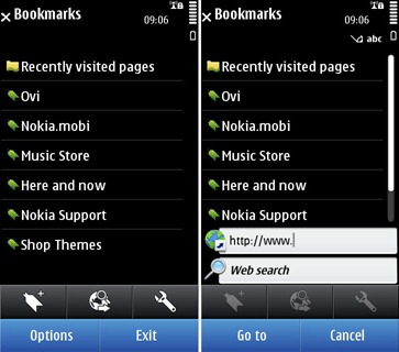
The web browser opens into a bookmarks page. Tapping the middle icon button reveals the address bar & a Google search bar (S^1 didn't have one; good to know they've been listening to users). On first start, you can choose between Google or Bing search.
The address bar does show suggestions (auto-completion), but due to Symbian's unique text input system, it's a fail. When typing text, Symbian shows a separate screen for the keyboard. So here's how it works - tap the address bar, text input screen shows up, type starting letters of website, confirm input, it goes back to web browser, related suggestions appear & then you tap on link. There is no real-time auto-complete. That's very archaic.
Very little has changed on the way the web browser works. After a few seconds, it goes into full screen mode, tapping the arrow shows the buttons again. The available navigation options & features are still the same. & in case you’re wondering, it still doesn’t have tabbed browsing!
Mobile version of websites work great. It's only when you try to load the actual webpage that the browser reveals its limitations. For instance, the browser is unusable until the page has fully loaded. If you're loading Engadget.com, that's 2 min of waiting time. Disabling Flash helps & disabling Javascript even more, but that's hardly an option when browsing sites. That said, both Facebook & Twitter work very well, although with a slight lag when refreshing content.
To go back to previously visited pages, you need to tap the Back button. & you're given this screen, with thumbnails of your pages. Looks great, except it's totally unusable! You can't flick through the thumbnails because it's oversensitive. Flick your finger through 1 cm, & it scrolls through all pages, back to the first page. The only way to use it is through the button... Epic UI fail!.
The one new feature with the browser is support for pinch-to-zoom. Has 2 quirks - it displays a chequerboard background while zooming out & the text remains in its original pixel size while zooming in. But it’s nothing compared to the mess that’s text rendering. There is almost no notion of anti-aliasing or sub-pixel rendering as the text looks garbled at every zoom level except 100%…
Another feature that stands out is Flashlite 4.0. Much better Flash support gives you access to tons of videos from different websites. It takes a while for the video to buffer, but once it does it can even play 720p videos on YouTube!
& watch football highlights. :D
Video review of the web browser...
This is what the portrait keypad on the N97 looked like.
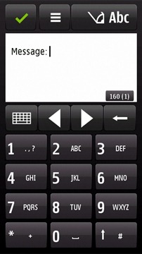
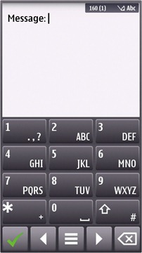
1 year on, this is what it looks like on the N8. A reshuffling of the layout with still no Qwerty keyboard. As you might expect, typing on this T9-enabled keypad is extremely hard, even with haptic feedback. I guess it's because of the bottom row of navigation & action buttons. If you use phones with traditional keypads, your fingers automatically goes to the bottom row expecting the ‘0’ key...
The different layouts with the symbols.
& emoticons!!! Some of them are animated.
The N97 had a physical Qwerty keyboard & hence had no on-screen Qwerty keyboard. Instead it had this landscape keypad.
The actual landscape Qwerty keyboard on S^1 looked like the above.
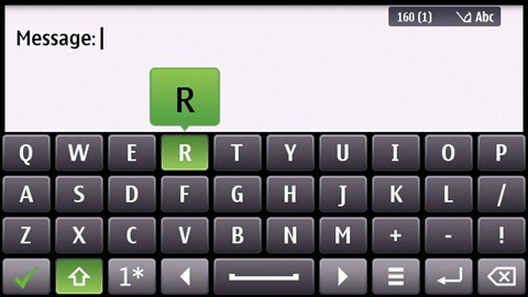
On S^3, it has received a major facelift, with the arrow & options buttons moving next to the spacebar, giving a much wider & cleaner text input box.
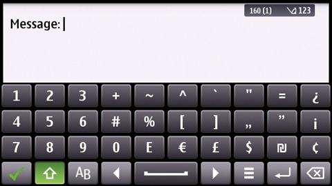
The different layouts of the keyboard... I like the compact numeric layout.
It's obvious that S^3's on-screen Qwerty is miles behind other OSes' keyboards. It doesn't support multi-touch, hence it's slower as you have to type each letter one at a time. Holding a key gives the capital letter of a character & a symbol for the numeric layout. Because there is no visual indication of what symbol you'll get (no small symbol printed in each key), it takes weeks of trial & error before you learn the position of each key.
Text auto-correction is available… once you figure out how to enable it.
Here's something to think upon - look at your keyboard. How are the keys spaced? They are staggered around & hardly follow a grid layout where each key is on top of each other. There is a reason why the keyboard designers built it this way - it improves key recognition & lessens accidental presses, making typing much faster...
Sadly, Symbian UI designers thought it was much better to reinvent the wheel with a Qwerty keyboard fitted in a grid.
Side buttons
If you’ve used a S60v5 device, I’m sure you have no love for those huge side buttons (or soft keys) that appeared in landscape. Well, good news, they’re now gone!
Well almost. The 2 main buttons move to the bottom, along with the clock & notification area.
For apps such as messaging, where a 2nd row of icons are used, they still move to the right side, but are much narrower.
One weird behaviour in landscape view is that the icons do not rotate from their initial position. They are re-arranged with the left-most going to the top.
In portrait view, the two-row buttons UI makes sense. The network, clock & battery indicators are at the top & so is the notification area (depends on the app; some like Music have a "full screen" mode). In landscape view, main buttons, clock & notification area move to the bottom, icons at the side & network/battery indicator at the top.
Once again, it's the 16:9 640x360 resolution that forces this half-baked solution. It's too narrow for buttons at the bottom, so these are placed at the sides because of the wide space available. Adopting such a resolution proved to be a great liability, forcing cumbersome UI restrictions. Great for watching movies, sucks for everything else. Such a conundrum can be easily solved – use the N900’s resolution of 800x480…
Wrap-up
Symbian^3 is a mixed blessing for the Nokia N8. For a device with such impressive hardware specs, like with N97, the UI keeps being underwhelming.
The new home screen is nothing more than the old home screen x 3. There is no fluidity moving from one screen to another. The new Task Manager hides Symbian’s superior multitasking capabilities by showing only 3 apps at a time. The web browser is still crap. There is no portrait keyboard.
That said, there are a few positives - the OS is extremely stable. If you look back to the UI inconsistencies I’ve noted in the N97, most of them has been fixed. No side buttons. Single tap. There’s an awesome notification area (which can be further developed into an Android-styled notifications system). Multi-touch has been implemented in some apps. But it's not enough!
With Symbian^3, the UI is moving in the right direction, but at a few baby steps at a time. What it really needs is a giant leap, not unlike WP7, to reignite interest into this platform.
Untitled from MoNoBrow on Vimeo.
I know that there are alternatives (Opera & Swype) & that the firmware update coming early next year will fix many of the problems I mentioned. As seen in the above video, (courtesy of MyNokiaBlog) there'll be a new Qt-coded browser, portrait keyboard (split screen, but the keys are still fixed in a grid layout) & a fix for the home screens. Furthermore, a late 2011 update will add a new UI & separate the browser from the OS (& adding HTML5 support).
However, I can't review a device based on future improvements. The fact is that, right now, the software on the N8 sucks...
This post was Part 2 of Nokia N8 Review series. The remaining posts are here:













Please don't spam & don't swear!
Subscribe to my feed
There doesn't seem to be much improvement between the S60v3 and the Symbian^3, apart from the thumnail previews on the task manager.
I agree that the N8 should have inherited from a much more evolved OS.
Hats off to this 2nd part of the review.
btw, I prefer the hardware more ;)
The N8 is a fantastic device on the hardware level. It simply has awesome specs.
The reason I want it? Amazing camera, wifi, touchscreen, FM Transmitter (I tend to use that a lot) in-built, among many other things.
The reason I won't buy it? Symbian! It's AGES behind iOS. Android is ahead of it, but still behind iOS in terms of usability. It's progressing rapidly, yes, but there are possible improvements.
Symbian OS is a lost case in terms of usability. It has decent performance and good development tools though. It's interface is not that pretty, and positioning can be a problem. Also, it's as if ^3 updated things, while completely forgetting others.
Now, imagine N8 running Android? Or imagine an iPhone with N8's specs? You'll know what Nokia has to do to level its profits again.
Mobiles today are not just hardware. Software and apps play a very great role. Something Nokia has yet to understand apparently...
@Inf
Nokia + Android = killer devices.
Yet, Nokia seems to be going for Windows Phone 7, an awesome-looking but very immature OS...
dont forget meego
@Anonymous
I was very excited about MeeGo until Eldar Murtazin reported that the N9's hardware has been ready since 6 months & the only reason why it hasn't been released is because MeeGo isn't ready.
Yeah, Eldar could just be spreading FUD but given Nokia's track record with their OS releases, I'm no longer that confident about MeeGo. Let's hope they do get it right this time.
That said, N8 is the last Nseries device with Symbian. :)
Nice review.
I was a fan of Symbian before although i never had a chance to own a symbian device. Now, i just hate Symbian because Android pwns it as from what i've been reading.
Nice review!! I've heard that the Google folks have been trying to seduce Nokia with the Android OS. So far no news from them. I still don't understand why Nokia is still allocating so much resources to the developement Symbian OS.
What would have been great from Nokia is to make a platform that can boot any OS you want, just like your personal home computer, you decide which OS to run. Having said that, the N9 users can switch to early versions of Meego.
What if Nokia can make its mobile phones run Android, Meego or Symbian? I believe this kind of openness is the future. Only then mobile manufacturers can really focus on the hardwares.
*previous comment: I meant N900 which can switch to Meego OS...not N9.
@Nitish
The N900 is indeed THE geek device, a truely mobile computer with the ability to boot several OSes - Maemo, MeeGo & Android (2.3!).
I'm pretty sure all users want that kind of openness. Imagine an N9 dual-booting MeeGo & Android (a version tweaked by Nokia). Ah, the possibilities!
Somehow, I can't see this happening in the near future... Apart from Nokia, none of the manufacturers will do it. :(
I certainly want that kind of openness! Nokia should scrap Symbian (or radically improve it) and go with Android, MeeGo or a heavily-enhanced Windows Phone 7 (why not? :p)... Best of all, allow us to choose which OS we want.
Like, when you buy your phone, you get access to their site, allowing you to download the OS of your choice or something. A simple flashing procedure + software should be made available too.
We'll see Nokia propel at the head of sales again.
On the other hand, why is Sony Ericsson always making high-end devices, but somewhere in the specs, you find a lower/mid feature instead of high-end one? Like X10's Android 1.6?
Post a Comment
Some html tags like <b>, <i>, <a> are allowed & emos can be used. ;)
Copy your comment before posting in case something fails.
Comments are moderated, may take a while to appear.